On Importance of Circulating Supply.

Our research has yielded a clear connection. If a project has a large total supply, but only a small chunk of that supply is unlocked at first, then token prices will go down in the future from supply pressure.
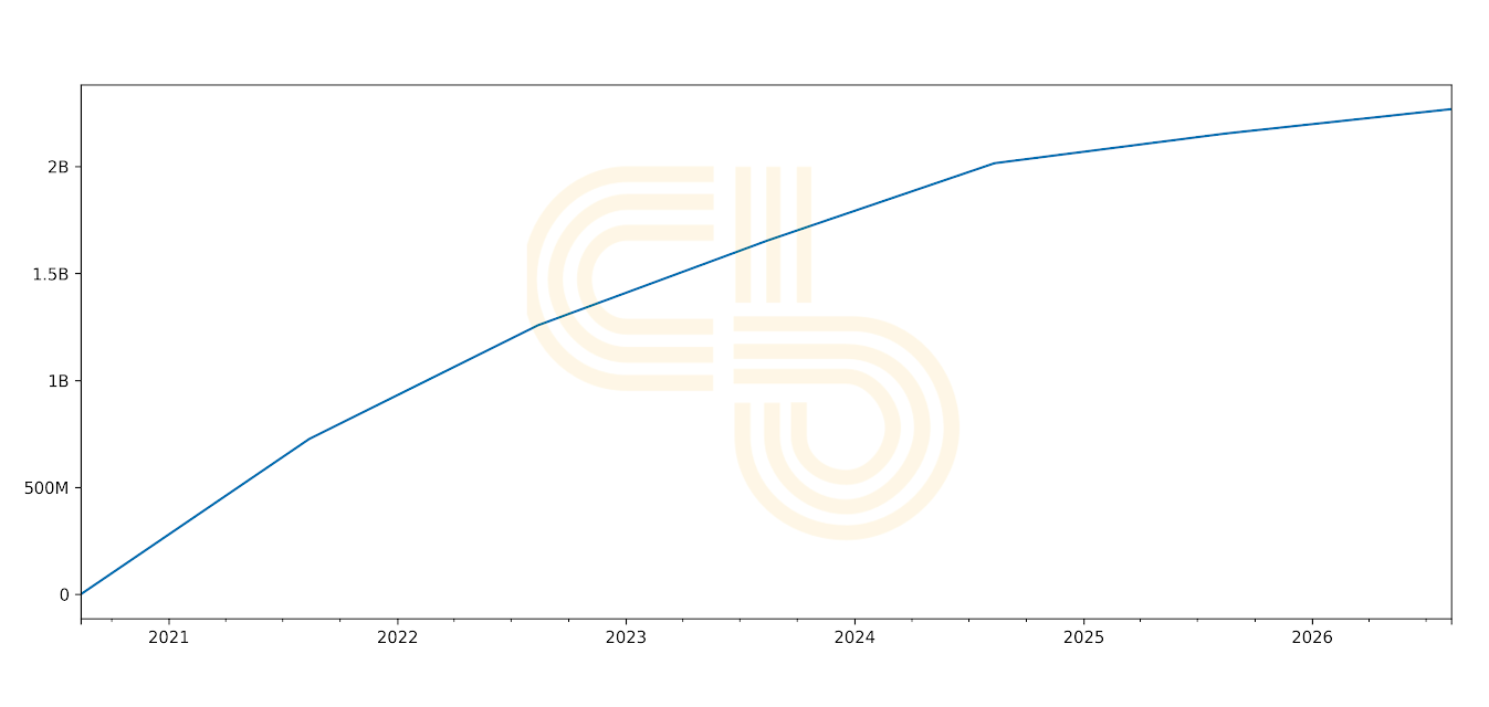
A typical example of a token unlock schedule looks like this:
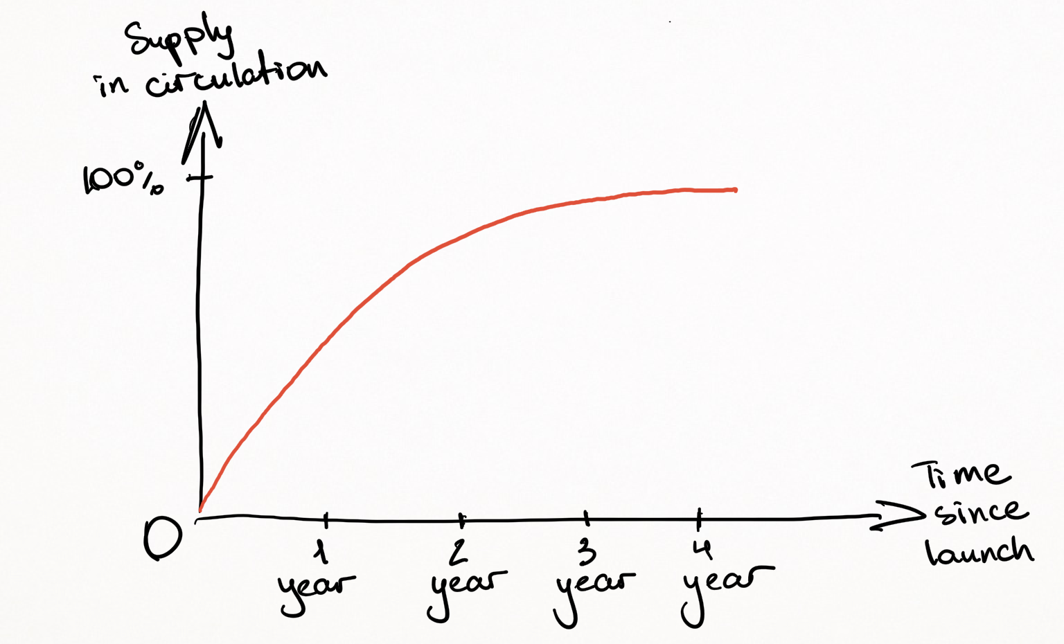
In the illustration above, you can see that more than half of the total supply enters circulation within two years of the token’s launch. Thus, annual inflation can be as high as 100%. When so many tokens end up on the open market, there is substantial pressure on the token’s price.
A project can provide various reasons for doing this. However, the most obvious reason for doing so is to create early excitement around the token’s initial price action.
In other words, by creating artificial scarcity at the project’s launch, the team makes it easy for market makers to pump the token’s price. The price surge helps the project get noticed by less sophisticated investors who generate demand through word of mouth.
More knowledgeable speculators usually get into such projects at early stages like pre-sales and public sales (i.e. ICO, IEO, IDO). Constrained circulating supply lets those investors sell or “flip” tokens at high prices as soon as tokens get listed on an exchange.
As the initial excitement fades, circulating supply inflation starts to kick in. If token economics does not include incentives for holding (such as staking rewards), a project’s ecosystem participants will likely liquidate their allocations as soon as they get unlocked.
Hence, if a project cannot generate sustainably growing demand for its token, the price will plummet due to an imbalance between supply and demand.
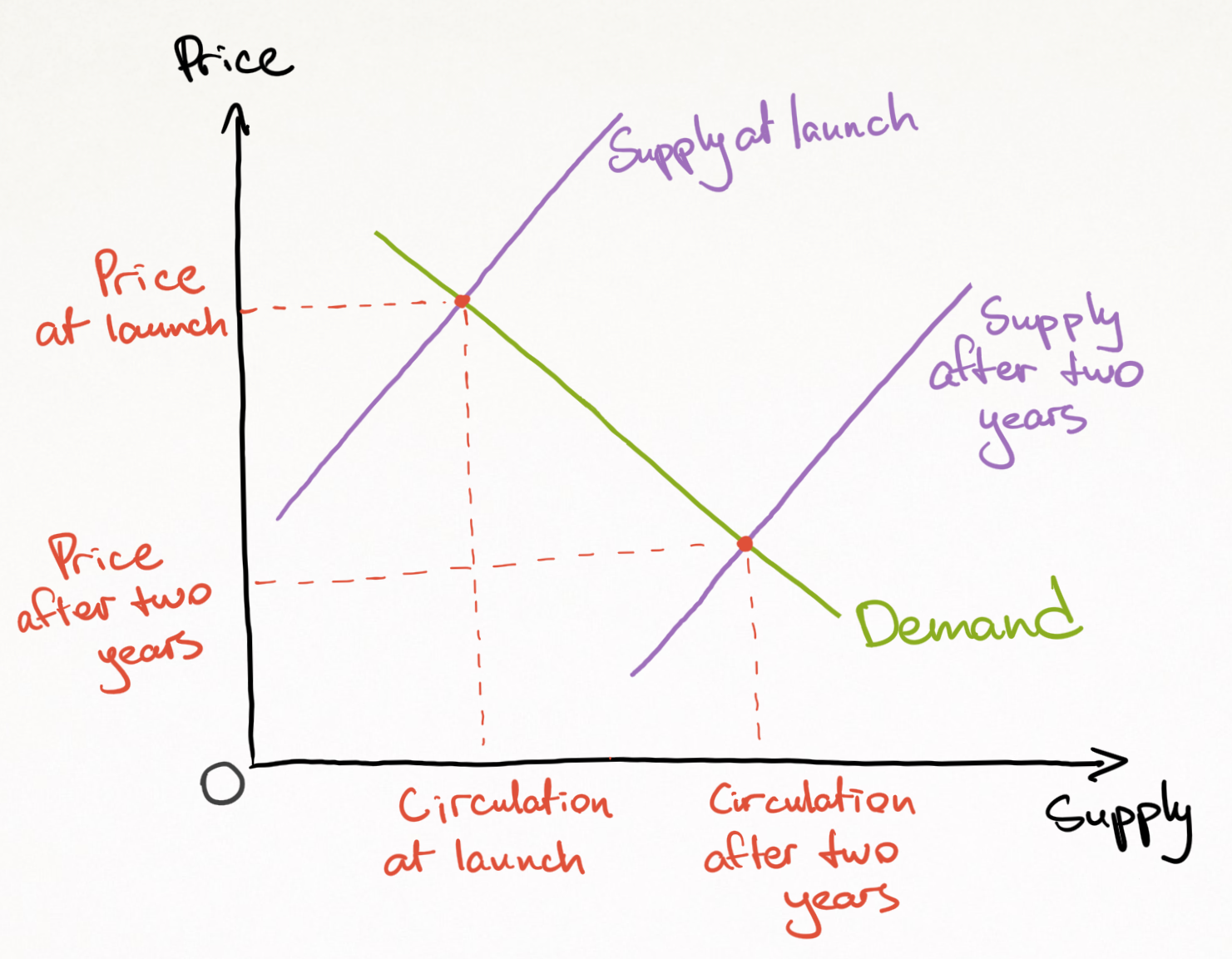
Here is a simple supply and demand graph. Even while demand remains the same, the increase in supply leads to falling prices, all else remaining equal.
Furthermore, low initial circulating supply can be misleading when you compare projects by their market caps. It can lead to a false perception that a project is “undervalued” because its market capitalization is lower than its competitors.
A token’s market cap is calculated by multiplying its price by its circulating supply. Hence, the results can be misleading if one element of the formula is significantly smaller than it should be.
Consider project A with a total supply of 1 million and the circulating supply of 100,000. It’s competitor, project B, has 1 billion total supply and 900 million circulating supply. A’s token price is $10, and B’s token price is $0.01.
To calculate A’s and B’s market caps, we multiply their circulating supplies by the prices.
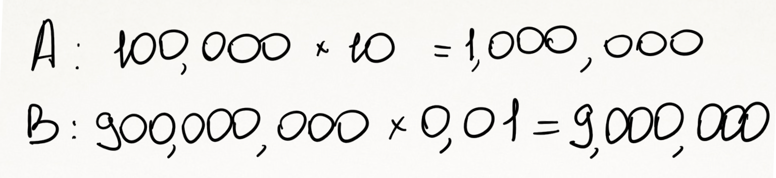
By market capitalization, it looks like project A is only worth $1 million compared to B, which is worth $9 million. Based on this information, a reckless investor might think that A has the potential to grow 9x to reach the scale of B.
However, another measure gives a much fairer comparison. “Fully diluted market cap” looks at total supply multiplied by price instead.
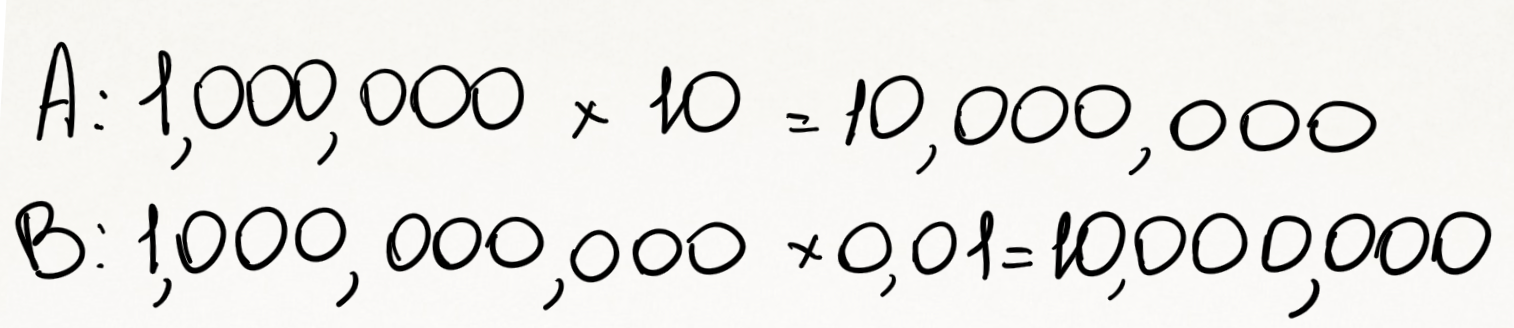
In light of this calculation, both projects have an equal fully diluted market cap. So, A doesn’t have 9x growth potential.
Furthermore, A has 90% of tokens locked, while B has only 10% of the total supply locked. Prices for A will actually decline much faster than B as more tokens enter the market.
Now that you know the caveats of low circulating supply, it’s time to look at some real examples.
Unlocking the Secrets of Circulating Supply
Curve Finance
Curve Finance can be briefly described as a decentralized exchange for similar cryptocurrencies. For example, Curve allows investors to exchange large amounts of two different dollar-backed coins (USDT and USDC) at a relatively low cost.
Curve Finance’s token, CRV, was initially introduced to allow users to govern the project through voting on the blockchain.
If you examine CRV’s circulating supply schedule, you will see a shocking trend. There’s overwhelming inflation, killing any potential price growth.
For instance, on Jan. 1, 2021, the circulating supply of CRV will be around 280 million tokens. Compare it to the circulating supply on Jan. 1, 2022, which will be 931 million tokens, which is more than three times higher.
CRV circulating supply inflation | Source: Curve Finance
Disclosure: The author of this newsletter holds ETH and FLOAT. Read our trading policy to see how SIMETRI protects its members against insider trading.
To mitigate the impact of circulating supply expansion, Curve’s team introduced an additional incentive for users who lock their tokens. However, only about 17% of the token holders decided to lock their tokens.
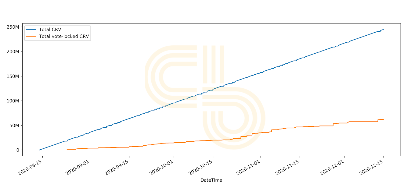
Circulating CRV (blue) vs. locked CRV | Source: Curve Finance
Due to supply pressure, CRV prices dumped after the initial excitement and continue to drop. You certainly don’t want to be the one left holding the back in this scenario!
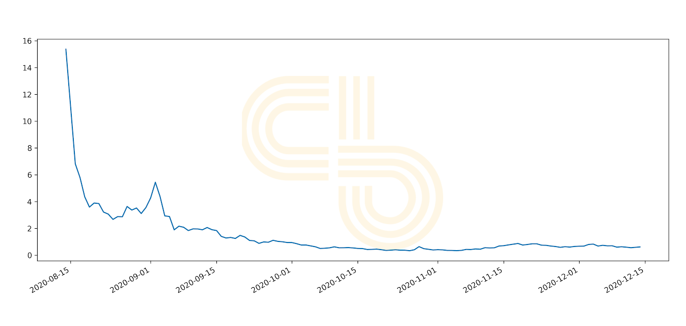
CRV price | Source: CoinGecko
Ripple’s XRP
Ripple is another great example. Despite recent explosive price action, Ripple has significant issues with its circulating supply. Over six years since the project’s XRP token was launched on exchanges, its circulating supply still hasn’t reached half of its total supply.
Ripple doesn’t have a mining mechanism; it’s team merely unlocks tokens. 100 billion tokens were printed at the project’s launch. Then, in 2017, the team decided to lock 55% of the total supply to ensure that the tokens will be distributed gradually.
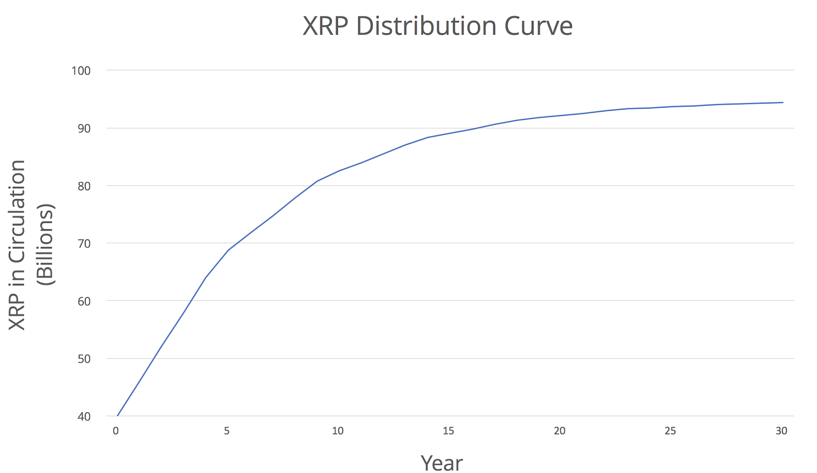
XRP distribution curve | Source: Ripple
This gradual unlocking process should have corresponded with a growing demand for XRP among institutions. But, because this didn’t happen at the expected rate, the team had to return most unlocked tokens to escrow.
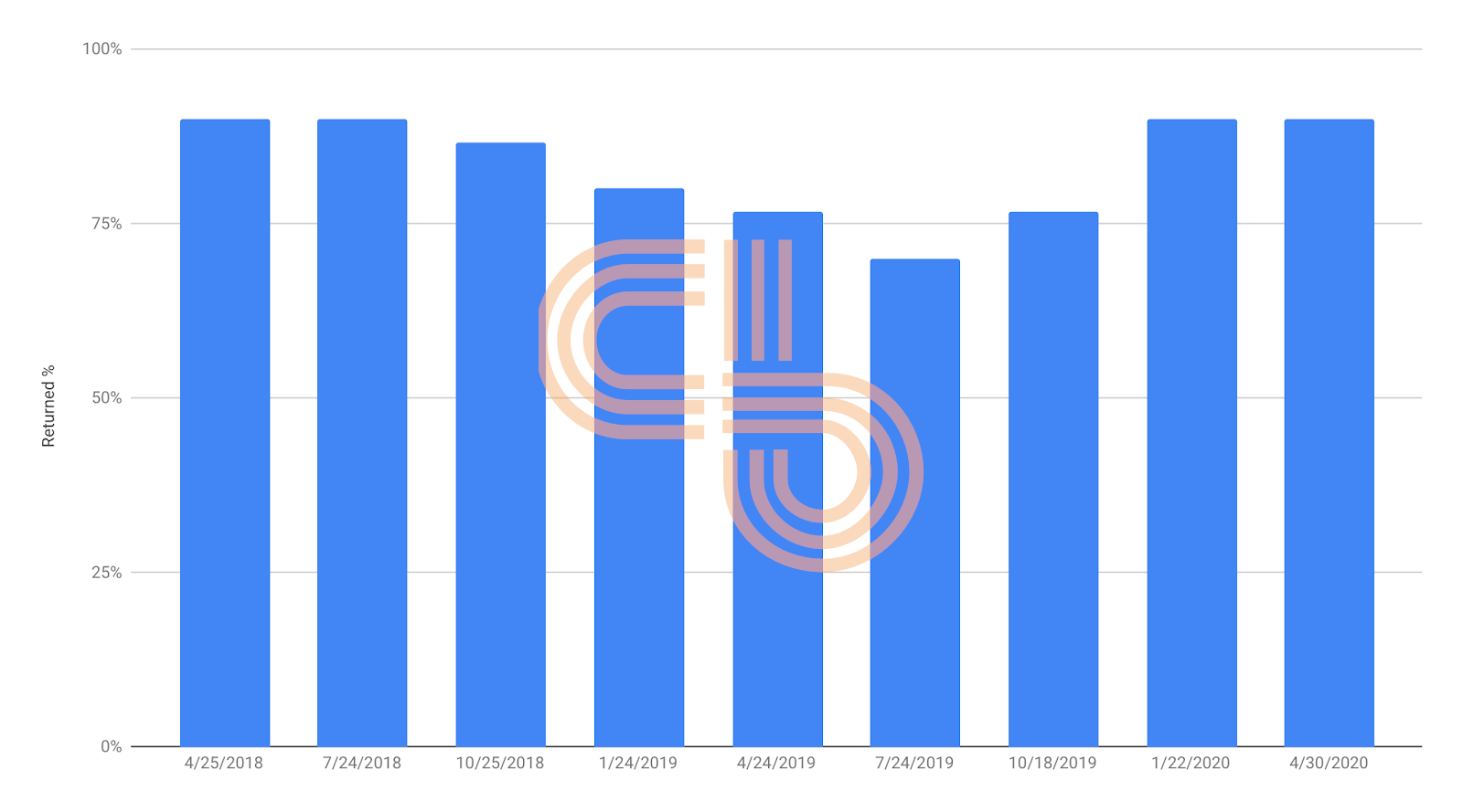
Percentage of released XRP returned to escrow | Source: Ripple Quarterly Markets Reports
XRP’s annual circulating supply increase has been roughly 6% since 2017. While this trend is not as devastating as it is in Curve’s case, it still creates continuous pressure on XRP since it lacks organic demand.
XRP is famous for its explosive growth during bull markets. However, because more than half of tokens are still locked, XRP can’t hold onto higher price levels because Ripple will inevitably dump their supply onto a hot market.
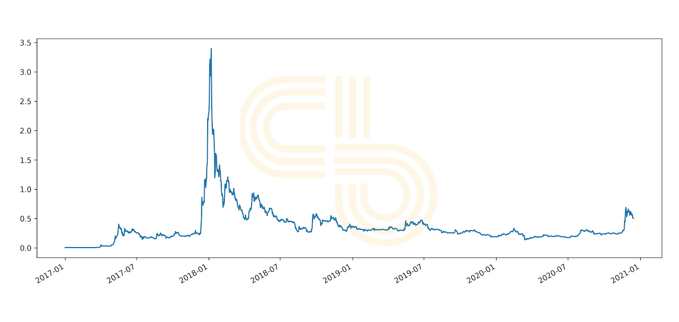
XRP price | Source: CoinGecko
QuarkChain
QuarkChain’s token, QKC, had staggering growth at its initial launch on Binance.
However, this growth was mainly due to the fact that only about 3.6% of the total QKC supply entered the market. Since then, the circulating supply of QKC increased over 17-times to roughly 64% over just two and a half years.
QuarkChain tried to curb the growth of its circulating supply by introducing a staking program, but it didn’t help sustain the token’s price.
Although the QKC supply situation improved over time, this incident provides a good illustration of how poorly designed token economics can harm a token’s price.
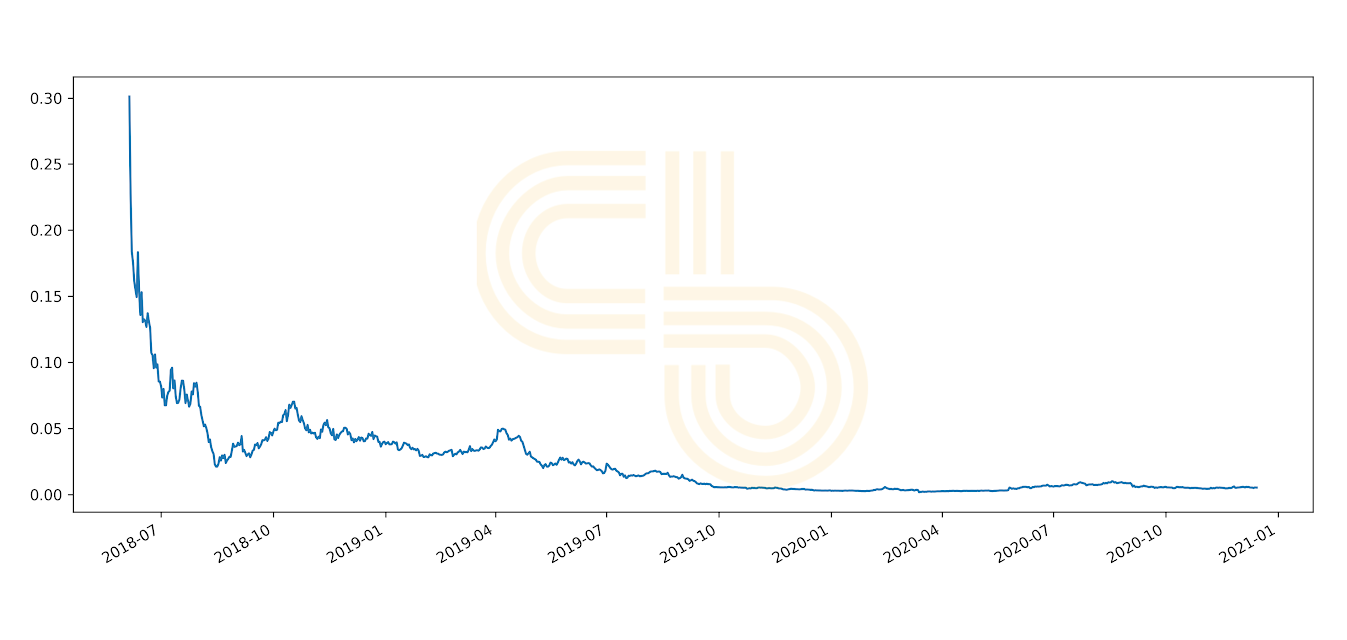
QKC prices | Source: CoinGecko
Token Economics Matter
Even fundamentally strong projects can implode due to flaws in their token economics. As a crypto investor, it’s essential to pay close attention to these economics when performing due diligence on a potential bet.
Understanding token release schedules will help you understand whether the project is undervalued compared to competitors. Moreover, it will help you spot projects with token economics designed for “flipping” and allow you to avoid buying those tokens at artificially high prices.
In SIMETRI, we learned to use token economics as a critical metric for analyzing projects. If a project has questionable token economics, it’s a red flag, and we won’t consider it a good buy.